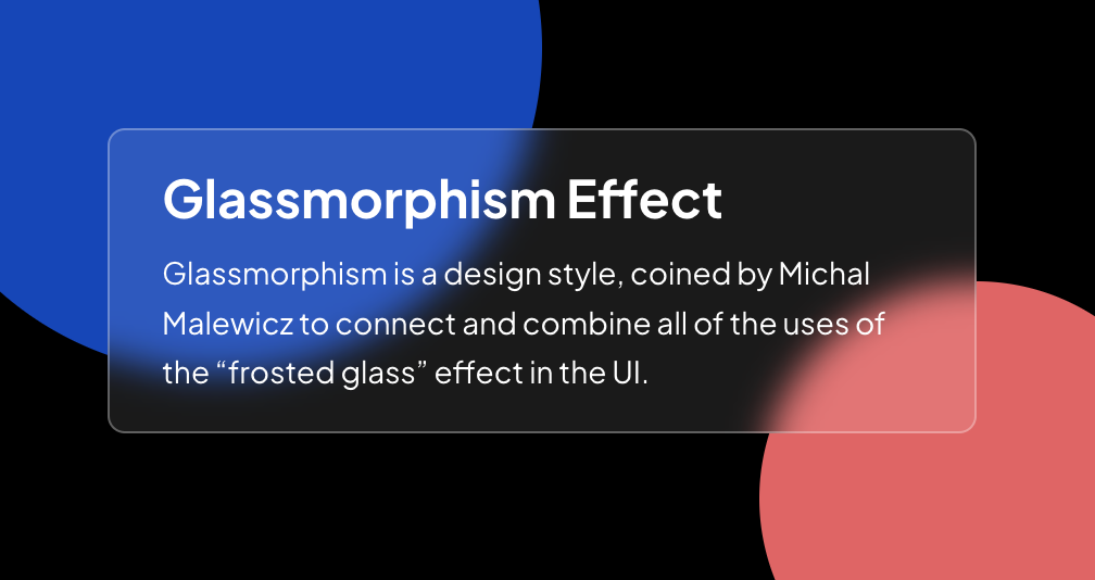
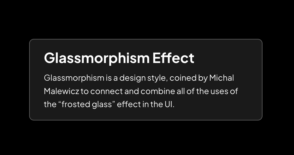
Glassmorphism Effect
Glassmorphism is a design style, coined by Michal Malewicz to connect and combine all of the uses of the “frosted glass” effect in the UI.
Controller
Glassmorphism Effect
Ridho Anandamal
22 May 2023 • 0 minutes
Glassmorphism is a design style, coined by Michal Malewicz to connect and combine all of the uses of the “frosted glass” effect in the UI.
This playground only use CSS
How to Create it
Lets create initital structure HTML.
index.html
<div class="container">
  <div class="card">
    <h1>Glassmorphism Effect</h1>
    <p>Glassmorphism is a design style, coined by Michal Malewicz to connect and combine all of the uses of the “frosted glass” effect in the UI.</p>
  </div>
  <div class="circle-1"></div>
  <div class="circle-2"></div>
</div>
Then we add style card and effect glass.
style.css
.container-effect {
  width: 100%;
  height: 100%;
  display: flex;
  justify-content: center;
  align-items: center;
  position: relative;
  background-color: black;
  padding: 16px;
  overflow: hidden;
}
.card {
  position: relative;
  z-index: 1;
  max-width: 400px;
  display: flex;
  flex-direction: column;
  gap: 8px;
  padding: 16px 24px;
  border-radius: 8px;
  background: rgba(255, 255, 255, 0.2);
  backdrop-filter: blur(8px);
  -webkit-backdrop-filter: blur(8px));
  border-radius: 8px;
  border: 1px solid rgba(255, 255, 255, 0.3);
}
.card > h1 {
  font-size: 24px;
  margin: 0;
  color: white;
}
.card > p {
  font-size: 14px;
  margin: 0;
  color: white;
}
Looks good, but we need the glass effect when there a background element. Let's we add two circle elements.
style.css
.circle-1 {
  position: absolute;
  width: 300px;
  height: 300px;
  left: calc(50% - 300px);
  top: calc(40% - 200px);
  background-color: #1646b7;
  border-radius: 10000px;
}
.circle-2 {
  position: absolute;
  width: 200px;
  height: 200px;
  right: calc(50% - 300px);
  bottom: calc(50% - 200px);
  background-color: #df6565;
  border-radius: 10000px;
}
Now we can see the effect.